MattBot

The goal of MattBot is to answer professional questions about me, at times when I'm not around. The aim was to provide a creative and interactive interface for anyone to ask questions and learn more about my background.

This chatbot was built using Azure Bot Service and the Microsoft Q&A Maker Tool.

MattBot is programmed to answer questions such as:

  • Tell me about yourself? Who is Matt?
  • What kind of work experience do you have? What is Matt's background?
  • What type of projects are you looking for? What kind of work are you interested in?
  • Tell me something Interesting about yourself? What is something cool about Matt?
  • How can I get in touch?

Try it out.

Sketchy Sections

Sketchy Sections is the award-winning project I participated in for the City of Seattle Hackathon hosted by GA.

Teams were given a day to develop a project which utilized public data provided by the City of Seattle and Socrata. The goal of the Hackathon was to promote the open data intuitive and civic action through open data portals.

I worked in a team of 6, with two web developers, two UX designers, and a fellow data scientist. Sketchy Section was our result.

The system serves to identify Seattle's most dangerous intersections by analyzing incident data against traffic signaling data. The results were displayed on an interactive heat map (above).

Click here to view an interactive version of the project.

Career recommender engine

The goal of this project was to create an AI-driven recommendation engine to assist guidance professionals in advising accurate career trajectories to their clients. Given the input of a new resume, could the system recommend new roles and skills for the client to progress in their career?

This project was conducted in collaboration with a local Seattle startup. The dataset was provided by a SQL database in the form of raw unformatted resume data.

Exploring the data:

The dataset contained 83,000 unique users.

Challenges:

Ambiguous and subjective resume content 

  • Account Manager vs Account Management
  • Computer Scientist vs Software Engineer
  • Buyer vs Vendor Manager 
  • Microsoft Word vs Word vs MS Word
     

Horizontal and vertical target:

Horizontal: Similar fields or industries

  • Accounting to Human Resources
  • Mechanical Engineer to Software Engineer

Vertical: Experience level

  • Junior to Senior
  • Supervisor to Manager

Step 1:

The first stage of the data from relies on a process called cosine similarity. Essentially this mean that we compare two vectors with one another and score how similar they are. In this instance we will compare the matrix that represents the users resume with the database of job titles and score how closely suited they are for each role.

Some data cleaning was required before we could construct the feature matrix. We used tf–idf to analyse the words within each resume. We  developed a scrub list to remove filler and irrelevant words.

Job title feature matrix

Job title feature matrix

  • X axis - job title keywords
  • Y axis - User id
  • Data - keyword frequency.

Step 2:

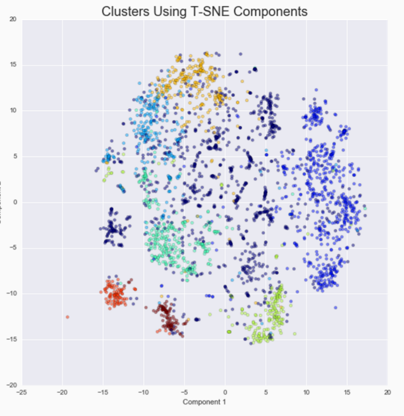
Principal component analysis (PCA) was used to reduce the dimensionality of the matrix. This reduces amount of features and allows the clustering algorithm to run more efficiently

Resulting matrix after PCA fed into an agglomerative clustering algorithm.

Clusters represent jobs most related by skills keywords
Intracluster recommendations = vertical career movement (usually)
Intercluster recommendations = horizontal career movement (again, usually)

Cluster 0 - Business, health, academia, labor
Cluster 1 - Software, data analysis, tech
Cluster 2 - Management, administration
Cluster 3 - Marketing and arts
Cluster 4 - Finance
Cluster 5 - PR, brand representative, service
Cluster 6 - Recruiting
Cluster 7 - Human Resources
 

Job Title Clustering Dendrogram

Job Title Clustering Dendrogram

Step 3:

To help aid the efficiency of the engine, we trained a multinomial logistic regression model to predict cluster association when a new user was added to the system. This enabled quicker response time since only the new resume would be analysed before a prediction could be made. 

In production, the model would be retrained on a scheduled basis, enabling updates to be added to the job title feature matrix.

The data flow:

  • A new user uploads custom resume to the system. The users text is imported, vectorized, and decomposed using PCA.
  • The logistic regression model is used against the user’s feature vector to predict a cluster number.
  • Within the engine, a python function extracts the key job titles and skills from within the cluster and prints a job report for the user.
     
Example report of a closely associated field

Example report of a closely associated field

Example report showing a distant recommendation

Example report showing a distant recommendation

Results:

Upon completion, the recommender engine produce reasonable results and providing suggested career trajectories and skills.

Further refinements:

  • Standardized input format for resume data
  • Improve jobs dataset from external data sources, ie: LinkedIn
  • Additional refinement on feature engineering and keyword filtering
  • Incorporate distributed systems and big data architecture at scale  
     

IMDB Decision Tree rating predictor

Problem statement


We aim to improve the netflix recommender based on the Top 250 on IMDB. We are looking to see what features publicly available from IMDB help to predict the IMDB rating. Does the actor, director or genre have a significant impact on the rating of the movie? Do public reviews reflect the rating of the movie?

Collecting the data

Using a combination of web scraping using beautiful soup, www.omdbapi.com and IMDB Pie.

First I scraped for the the basic information about the movie from omdbapi, then when to IMDB to collect movie finance information. IMDB Pie was useful for viewer reviews.

Data Munging.

Create dummies based on actor and genre.

Project 3: Liquor Sales + Linear Regression

Scenario 1: State tax board

You are a data scientist in residence at the Iowa State tax board. The Iowa State legislature is considering changes in the liquor tax rates and wants a report of current liquor sales by county and projections for the rest of the year.

Getting started.

First step in getting started is to import the tools and data set needed for this project. Here I used Pandas and Numpy for data manipulation. I used SKLearn to create a linear regression model from my data.

import pandas as pd
import numpy as np

from sklearn import datasets, linear_model, metrics
from sklearn.cross_validation import cross_val_score, cross_val_predict, train_test_split
from sklearn.metrics import r2_score

## Load the data into a DataFrame
df = pd.read_csv('../Iowa_Liquor_sales_sample_10pct.csv')

## Transform the dates if needed, e.g.
df["Date"] = pd.to_datetime(df["Date"], format="%m/%d/%Y")

Explore the data

Once the data has been imported, explore the data using the following functions.

print df.head()
print df.describe()
df.shape
df.info()
  • .head() - head will provide a snap shot of the top 5 values from each column. This is usefully to see what type of data you are working with - labels, strings and numerical values.
  • .describe() - describe is very useful at summerizing the numerical values from you data set.
  • shape - shape gives you a quick snap shot of the size of your data in rows and columns.
  • .info() - will provide a quick summery of they data types contained in each column. It also helps to spot null values.

During my cleaning process I chose to drop the redundant columns. In this

#Drop redundent data columns
df.drop('Volume Sold (Gallons)', axis=1, inplace=True)
df.drop('Category', axis=1, inplace=True)

#Rename columns
df.columns = ['date', 'store_number','city','zip_code','county_number','county',
              'cat_name','vendor','item_number','item_desc','btl_vol','st_btl_cost',
              'st_btl_retail','btls_sold','sale','vol_sold']

#Convert the data types of State Bottle Cost
df['sale'] = [float(x.replace('$','')) for x in df['sale']]
df['st_btl_cost'] = [float(x.replace('$','')) for x in df['st_btl_cost']]
df['st_btl_retail'] = [float(x.replace('$','')) for x in df['st_btl_retail']]

Billboard Hits + Data Munging

Problem statement

Explore

Exploring data sets within python is made exponentially easier with some very helpful libraries.

For this project I utilized the following packages:

  • pandas
  • numpy
  • seaborn
  • Matplotlib.pyplot
import pandas as pd
import numpy as np
import seaborn as sns
import matplotlib.pyplot as plt

%matplotlib inline
data = pd.read_csv("../assets/billboard.csv")

My preferred method of preliminary data exploration is to use the following three commands:

print data.columns.values
print data.head(5)
print data.shape

.shape() calculates length and width of the table. This provides insight into the structure of the data set and the number of values you can expect to be working with.

data.columns.values shows the current column titles. This helps to identify which columns to call and rename if needed.

.head(5) gives a the top 5 rows from each column. This function shows the type of data contained in the array, detailing how it has been collected and formatted.

The exploring your data is a useful step for identifying null values, strange formatting and unusable data types. Within the “billboard” data set, we notice null values contained in the later columns of the data set.


Clean

The first step I took in cleaning the data was by renaming columns. I renamed “artist_inverted” to simply “artist”, and each week column was converted to numerical values representing that week.

## rename columns.
new_cols = ['year', 'artist', 'track', 'time', 'genre', 'date.entered', 'date.peaked', 
            1, 2, 3, 4, 5, 6, 7, 8, 9, 10, 11, 12, 13, 14, 15, 16, 17, 18, 19, 20,
            21, 22, 23, 24, 25, 26, 27, 28, 29, 30, 31, 32, 33, 34, 35, 36, 37, 38, 39, 
            40, 41, 42, 43, 44, 45, 46, 47, 48, 49, 50, 51, 52, 53, 54, 55, 56, 57, 58, 59, 
            60, 61, 62, 63, 64, 65, 66, 67, 68, 69, 70, 71, 72, 73, 74, 75, 76,]
data.columns = new_cols

Next, I chose to melt the table the “week” columns into a single column containing the numerical value corresponding to that week.

#Melt the table and drop columns unused columns. Drop rows containing null values
billboard = pd.melt(data, id_vars=data.ix[:,:7].columns.values, var_name='week', value_name='rank')
billboard.drop('year', axis=1, inplace=True)
billboard.drop('date.entered', axis=1, inplace=True)
billboard.drop('date.peaked', axis=1, inplace=True)
billboard.dropna(axis=0, how='any', inplace=True)


After this I chose to drop columns that were unnecessary to my analysis, this included: ”year”, “date-entered” and “data-peaked”.

Finally, I chose to drop any rows which contain null values. This helps to contain the length of weeks within a range of given values (as opposed to an arbitrary length).

The resulting array dimensions are now 5307 rows × 6 columns.


Visualize

It is interesting to note that some tracks appear to follow a similar trajectory as they peak throughout the charts.